Project Description
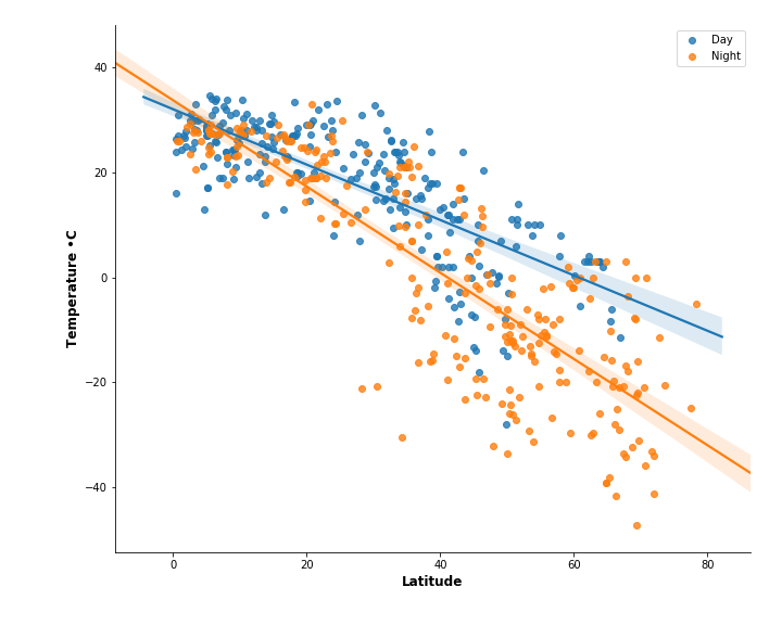
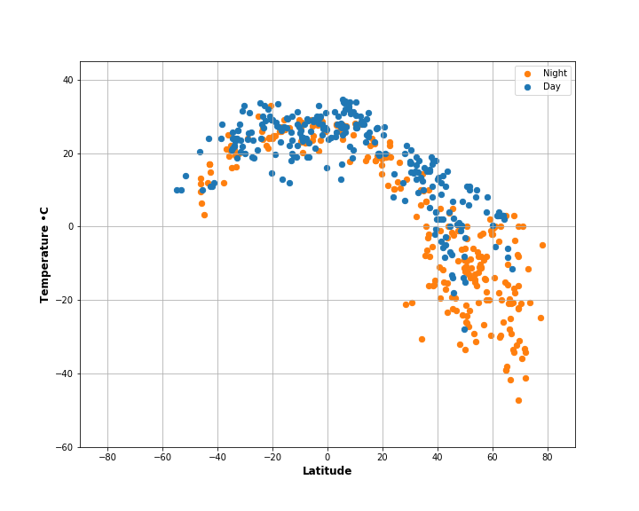
This project aimed to show that global temperatures rise nearer to the equator. To test this theory, I created a Python script to visualize the weather of 500+ cities across the world of varying distance from the equator.
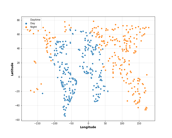
Using Python's Numpy, Pandas, and CityPy modules and the OpenWeatherMap API, I was able to generate a dataset that was representative of global land masses.
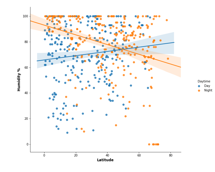
Seaborn and Matplotlib were used to compare values in regions where measurements were taken in daytime and night, looking at the following comparisons:
- Temperature (F) vs. Latitude
- Humidity (%) vs. Latitude
- Cloudiness (%) vs. Latitude
- Wind Speed (mph) vs. Latitude
The analysis demonstrates that there is an inverse relationship between absolute value of latitude and temperature.
Visualizations